I am the ghost of groovymother.com. Woooooo!

This is an old page from Rod Begbie's blog.

It only exists in an attempt to prevent linkrot. No new content will be added to this site, and links and images are liable to be broken. Check out begbie.com to find where I'm posting stuff these days.

Filed under 'typography'

April 6, 2012

Avería – The Average Font

Font designed by averaging out the letterforms of a few hundred fonts. Surprisingly readable.

Filed under : :

March 19, 2012

Frustro: The Impossible Typeface

Font inspired by the penrose triangle. More typefaces should make your brain hurt.

Filed under : :
via |

August 16, 2010

Adobe partners with Typekit to bring legendary typefaces to the web

Amazing! Garamond, Cooper Black and Myriad just became web-safe fonts.

(First person to use Trajan on a website gets a crotch-punch, though)

Filed under : : :

July 17, 2010

iFontMaker – The First & Fastest Font Editor for iPad

Super-simple typeface designer for iPad. Touch interface to sketch your font, then it uploads it to a website for sharing.

Filed under : : : :
via |

February 27, 2010

Effing Typeface

Rude typography.

Filed under : : :
via |

February 23, 2010

Hot Pockets Ingredients

Appetizing typography.

Filed under : : :

October 19, 2009

The smartest thing the Android team ever did

Looking at the screenshots of the forthcoming release of Android, I can’t help but notice one thing.

The typography.

More than anything, what draws my eye and makes it clear that I’m looking at an Android screen, not an iPhone, is the beautifully designed, decidedly not-Helvetica, typeface.

Here’s hoping the Android experience starts to catch up, and surpass, Apple’s. Nothing would make me happier than choosing an Android-based phone next time I want to upgrade.
Filed under : :

October 27, 2008

typeface.js -- Rendering text with Javascript, <canvas>, and VML

Amazingly clever piece of hackery. Embed fonts seamlessly in your pages in a manner that works with all released major browsers (including iPhone), but degrades gracefully. Need to do some playing with this…

Filed under : : : : :
via |

September 26, 2008

National Punctuation Day Reignites Interrobang Passion

Are these interrobangs lovely, or what‽

Filed under : :
via |

July 27, 2008

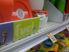
I believe that is meant to say “fuel”

I believe that is meant to say “fuel”

but that's not what I saw when it caught my eye in the supermarket. This is what happens when your designer doesn't give a, ahem, "fuel".

January 29, 2008

What font says 'Change'? - The Boston Globe

Type designers decode the presidential candidates.

Filed under : : : :

September 12, 2006

Johnston (typeface) - Wikipedia, the free encyclopedia

Turns out that the official London Underground typeface is not, as I had been lead to believe, Gill Sans, but instead “Johnston”.

May 27, 2006

fontblog : Interrobang?! — Interrobang!?

Microsoft have been sneaking the Interrobang glyph into their latest fonts. Who’d have thunk it&#8253;

Filed under : : :
via |

November 11, 2005

Ambigrams

Interesting collection of word designs that read the same forwards, backwards, upwards, downwards, etc.

Filed under : : :
via |

September 9, 2005

The Grauniad's new look

So farewell then, Garamond Italic and Helvetica Black.

Filed under : : : : :

About This Site

This is an archive of groovmother.com, the old blog run by Rod Begbie — A Scottish geek who lives in San Francisco, CA.

I'm the co-founder of Sōsh, your handy-dandy guide for things to do in San Francisco this weekend.